Michelman Additives Portfolio Trifold
product properties & description guide
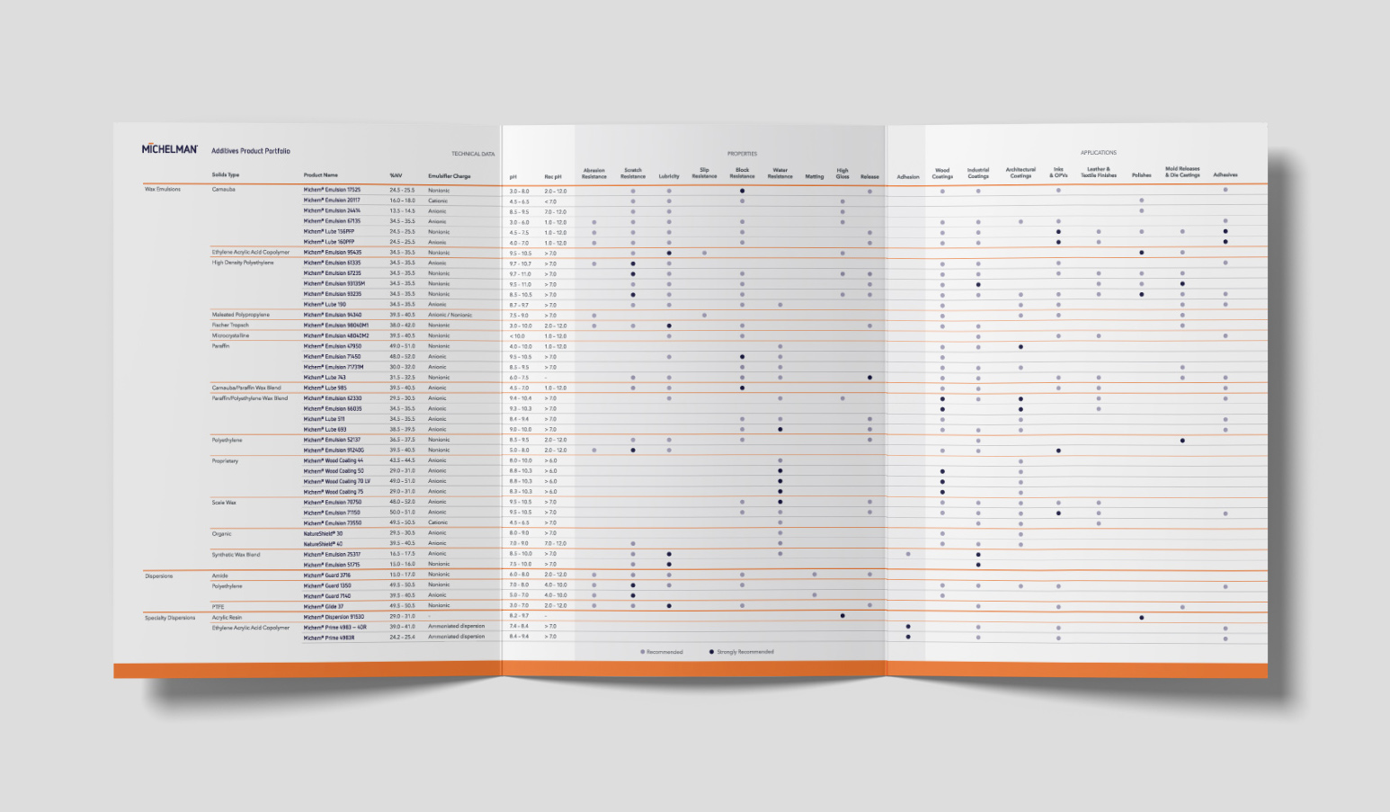
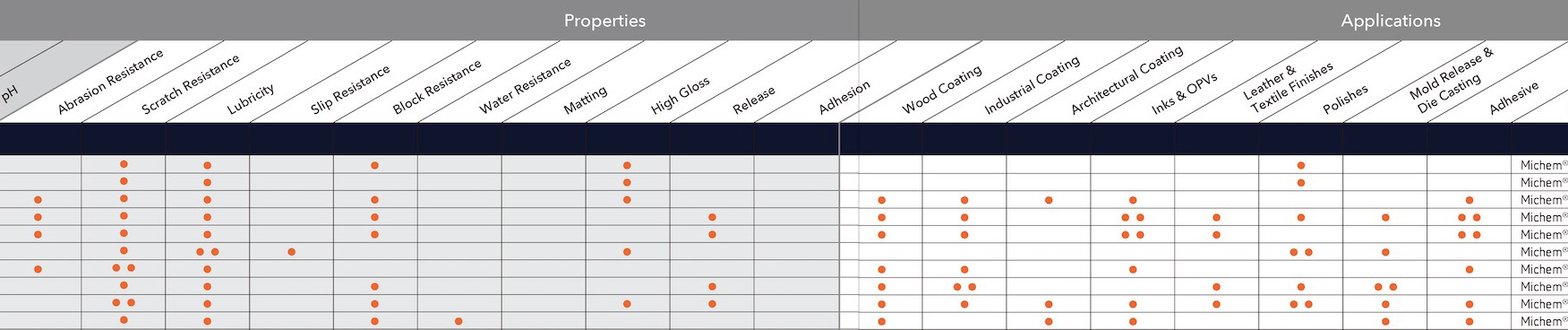
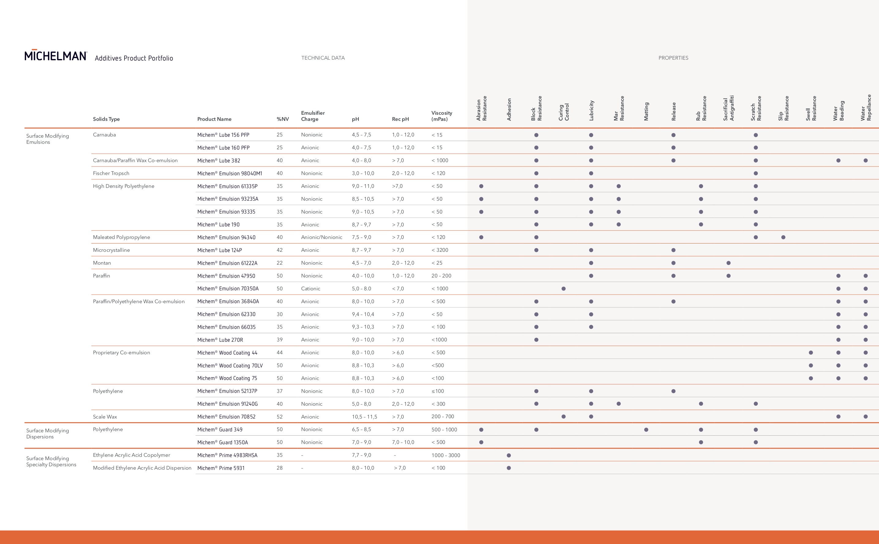
I spent the last year working as a Graphic Design Intern in the communications department at Michelman, Inc., a chemical manufacturing company just outside of Cincinnati, OH. While there I helped update old literature to fit current branding standards, including the piece here. This particular trifold is used by Michelman's Coatings business unit to inform customers which products work best for them and why. It is often used at tradeshows, where reading at a glance is important.
Redesign Process
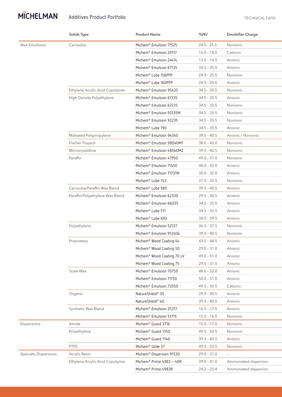
I worked with the communications, marketing, and sales teams to modernize the table by grouping the products by category, improving hierarchy and grid, removing distracting backgrounds and lines, and clarifying descriptions. The redesign (left) groups the products first by emulsion/dispersion classification, then alphabetically by solids type, emphasized by orange lines of corresponding weights. To enforce Michelman branding, the product names were kept in the company display font but set to Michelman Purple, opposed to all of the type being in a dark gray.
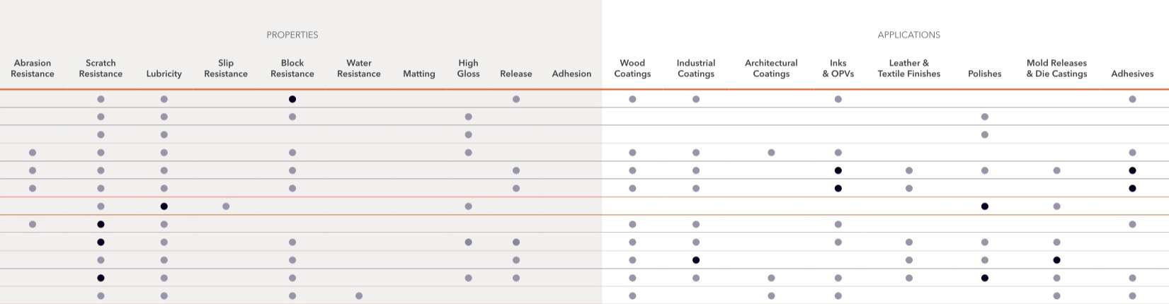
We decided it was more successful to use tints of a color instead of the number of dots to show property strength level at a quick glance.
Fitting the Design to Different Region Needs
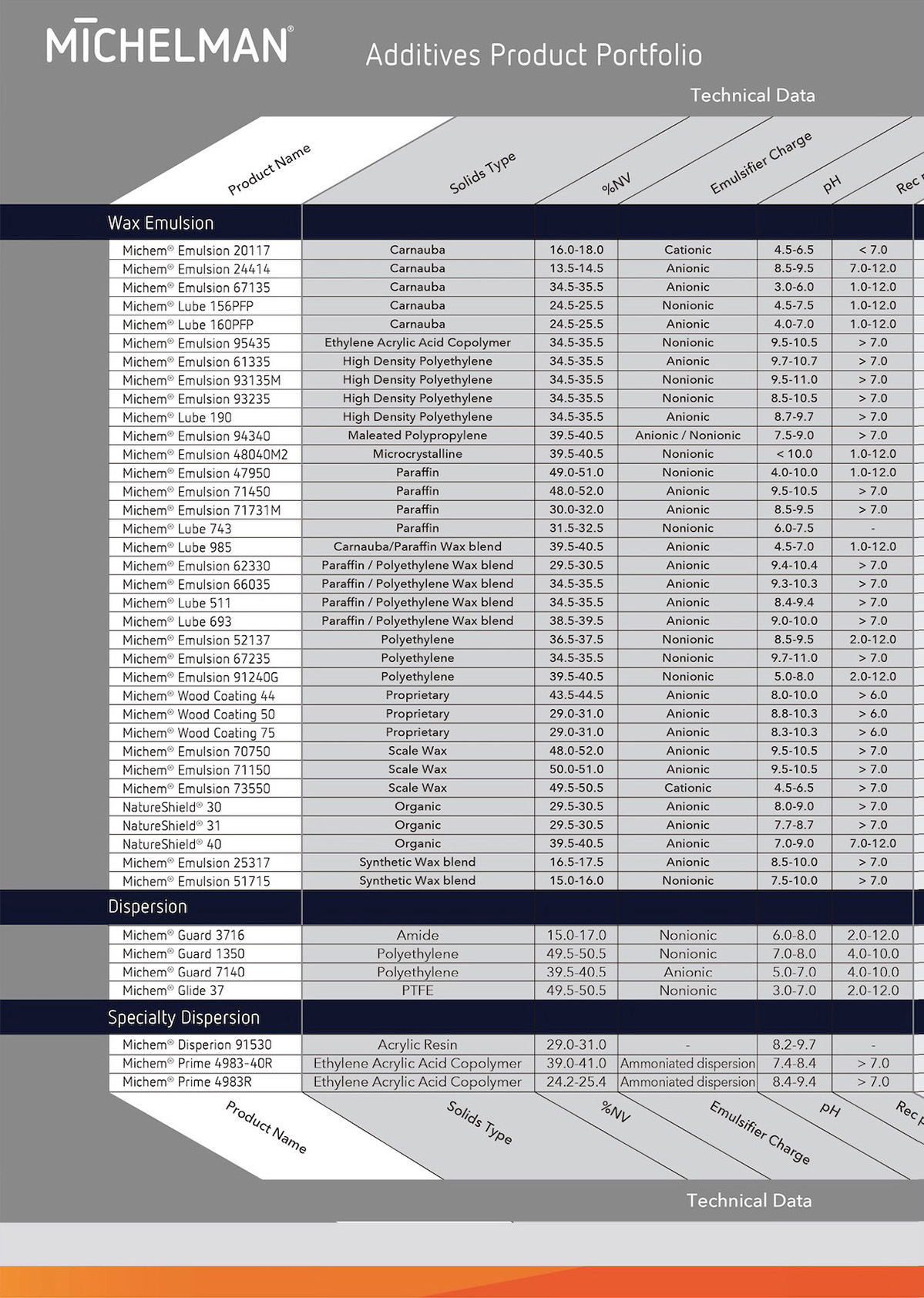
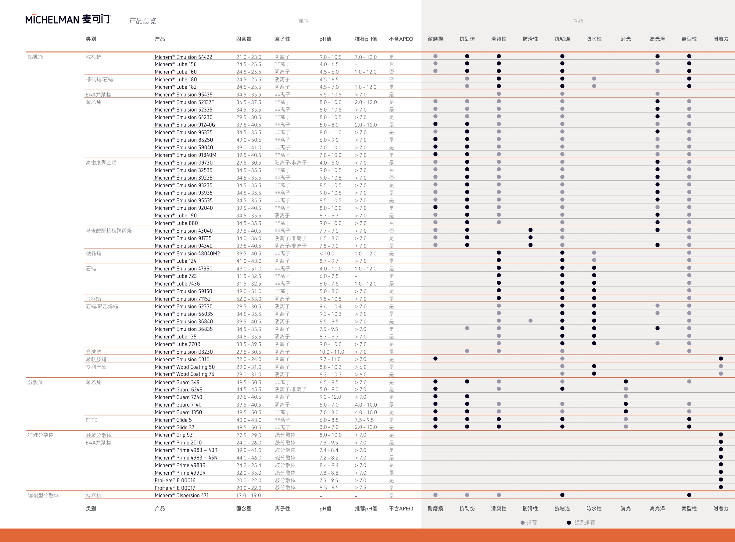
I adapted my design of the trifold to the different languages and regions that Michelman operates in, such as for the European version (top) that has less products but more properties, and the Chinese version (bottom) that uses more products but less properties than the US version.
View full PDFs from different regions here: